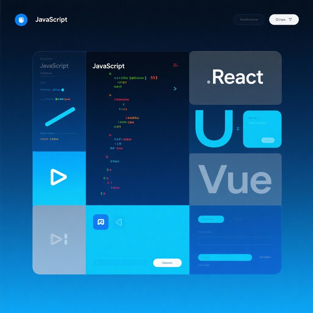
react-bits Components: Animated, Customizable React UI for Memorable Sites
Discover react-bits components, a leading React component library offering 110+ animated React components to elevate 2025 web interfaces. With 25,000+ GitHub stars, these customizable, interactive elements help create memorable, engaging UIs—ideal for developers aiming to enhance site appeal and user experience.
react-bits Components: Elevate Your UI with 110+ Animated React Components in 2025
In today's competitive web development landscape, creating memorable user interfaces requires more than just functional components—it demands engaging, interactive elements that capture attention. This is where react-bits components shine. As a comprehensive library of React animated components with over 25,000 GitHub stars and continuous growth since its launch in August 2024, react-bits has quickly established itself as a go-to resource for developers seeking to enhance their applications with high-quality animations and interactions. Whether you need subtle text animations or complex animated React UI elements, react-bits delivers a versatile collection of customizable React components that integrate seamlessly into modern React projects.
Why react-bits Stands Out in the React Component Ecosystem
In a market flooded with UI libraries, react-bits distinguishes itself through its singular focus on animation quality, customization depth, and developer experience. Unlike generic component libraries that treat animations as afterthoughts, react-bits was built from the ground up with motion and interactivity as core principles. This specialized approach results in components that feel polished, performant, and purpose-built for creating engaging user experiences.
What truly separates react-bits from alternatives is its commitment to flexibility. With support for both JavaScript and TypeScript, along with options for CSS or Tailwind styling (JS-CSS, JS-TW, TS-CSS, TS-TW variants), the library accommodates diverse development preferences and project requirements. This versatility ensures that whether you're working on a personal portfolio or a large enterprise application, react-bits can adapt to your existing codebase and styling conventions.
Core Features of react-bits: More Than Just React Animated Components
A Comprehensive Library of 110+ Components
react-bits boasts an impressive collection of over 110 components, with new additions weekly. These components are thoughtfully organized into four main categories, ensuring you can find exactly what you need for any UI scenario:
- Text Animations: Transform static text into dynamic elements with typing effects, scroll-reveal animations, character transitions, and more
- General Animations: From loading spinners to complex transition effects that enhance user interactions
- UI Components: Animated buttons, cards, modals, and navigation elements that add polish to your interface
- Background Animations: Subtle or eye-catching background effects that create depth without overwhelming content
Designed for Customization and Performance
Every component in react-bits is built with customization in mind. Through intuitive props, you can easily modify animation duration, easing functions, colors, sizes, and interaction triggers to match your design system. This level of control ensures your animations enhance your brand identity rather than appearing generic.
Despite their visual complexity, react-bits components are optimized for performance. The library uses minimal dependencies and leverages CSS transitions and hardware-accelerated properties where possible, ensuring smooth animations even on lower-powered devices. This focus on performance makes react-bits suitable for production environments where both user experience and page speed are critical.
Getting Started with react-bits Installation
Adding react-bits to your project is straightforward thanks to its support for modern package managers and CLI tools. The library offers multiple installation paths to accommodate different project setups:
Installation via Package Managers
For most React projects, you can install react-bits components using npm or yarn:
bash
## Using npm
npm install react-bits

## Using yarn
yarn add react-bits
CLI Installation for Rapid Development
For even faster integration, react-bits supports installation via shadcn and jsrepo CLI tools. This approach lets you add individual components directly to your project without installing the entire library:
bash
## Example with shadcn
npx shadcn-ui@latest add react-bits/animated-button

## Example with jsrepo
npx jsrepo add react-bits/typing-text
This component-specific installation helps keep your project size minimal by only including the code you actually use.
Importing and Using Components
Once installed, using react-bits components is as simple as importing them and adding them to your JSX:
jsx
import { TypingText } from 'react-bits/text-animations';
import { AnimatedButton } from 'react-bits/components';

function HeroSection() {
  return (
    <div className="hero">
      <TypingText
        text="Welcome to Our Platform"
        speed={80}
        loop={false}
        cursor="|"
      />
      <AnimatedButton
        variant="pulse"
        onClick={() => console.log("Button clicked!")}
        color="#2563eb"
      >
        Get Started
      </AnimatedButton>
    </div>
  );
}
Exploring Key Component Categories
Text Animations: Beyond Basic Typography
react-bits truly excels as a React text animation library, offering a wide range of effects that can transform ordinary text into engaging storytelling elements. The TypingText component creates the illusion of live typing, complete with customizable cursor and speed controls. For more dramatic effects, the ScrollRevealText animates text as it enters the viewport, creating a sense of discovery as users scroll through your content.
One particularly impressive text component is CharacterWave, which makes text appear to ripple across the screen character by character. This effect works exceptionally well for headings and call-to-action elements that need to grab attention without being distracting.
Interactive Components: Enhancing User Engagement
react-bits' collection of React interactive components goes beyond simple animations to create meaningful user experiences. The HoverCard component, for example, transforms static cards into dynamic elements that reveal additional information with smooth transitions when users hover. Similarly, the PullToRefresh component adds mobile-like refresh functionality to desktop applications, creating a familiar interaction pattern across devices.
The AnimatedTabs component demonstrates how react-bits elevates common UI patterns—tab navigation becomes more intuitive with smooth transitions between content panels, giving users clear visual feedback as they interact with your application.
Background Animations: Setting the Right Mood
For developers seeking to add atmosphere to their interfaces, react-bits' React background animations provide subtle yet effective options. The GradientBackground component creates smooth color transitions that can shift gradually or in response to user interactions. For more dynamic backgrounds, ParticleNetwork generates interactive particle systems that respond to mouse movements, creating a sense of depth and responsiveness.
These background animations are designed to complement content rather than compete with it, with adjustable opacity and intensity settings that ensure text remains readable while adding visual interest to otherwise plain backgrounds.
Real-World Applications: When to Use react-bits
react-bits components shine in numerous scenarios across different project types:
- Marketing Websites: Capture visitor attention with animated headings and interactive elements that highlight key messaging
- Portfolio Sites: Showcase your work with subtle animations that demonstrate your attention to detail
- E-commerce Platforms: Use micro-interactions on product cards and buttons to enhance the shopping experience
- Dashboard Interfaces: Add subtle animations to data visualizations and UI elements to improve usability
- Educational Platforms: Use text animations to emphasize important concepts and create engaging learning experiences
The library's versatility makes it suitable for projects of all sizes, from personal blogs to enterprise applications. Whether you need a single text animation or a comprehensive set of interactive components, react-bits provides the building blocks to create memorable UIs without the overhead of building custom animations from scratch.
Comparing react-bits to Other React Component Libraries
While there are several excellent React component libraries available, react-bits distinguishes itself through its singular focus on animation quality and quantity. Unlike more general libraries that include a few animated components alongside static ones, react-bits delivers a specialized collection where every element is designed with motion in mind.
Compared to dedicated animation libraries like Framer Motion or React Spring, react-bits offers more pre-built, ready-to-use components rather than animation primitives. This makes it ideal for developers who want to implement high-quality animations quickly without deep animation expertise.
The library's CLI installation support also sets it apart, allowing for component-by-component installation that keeps bundle sizes small. This approach contrasts with many competing libraries that require installing the entire package regardless of how many components you actually use.
Conclusion: Elevate Your React Projects with react-bits
In a digital landscape where user attention is scarce, well-designed animations can make the difference between a forgettable and memorable user experience. react-bits empowers developers to create professional-grade animated interfaces without the complexity of building custom animation systems from scratch.
With its extensive collection of over 110 React website components, multiple variants to suit different coding styles, and focus on performance and customization, react-bits has earned its place as one of the most exciting React component libraries available in 2025. Whether you're a seasoned developer looking to save time or a newcomer wanting to add polish to your projects, react-bits offers the tools you need to create standout UIs.
As web development continues to evolve, libraries like react-bits that prioritize both developer experience and end-user engagement will become increasingly valuable. By leveraging these pre-built, customizable components, you can focus on what matters most—creating exceptional user experiences and building the core functionality of your application.
Ready to transform your React applications with stunning animations and interactive elements? Visit the official documentation at reactbits.dev to explore the full component library and start integrating react-bits into your projects today.