Material UI React Components: Complete 2025 Implementation Guide
Master Material UI React components with this 2025 implementation guide – your definitive resource for leveraging the leading React component library. Learn to integrate Material Design seamlessly into React projects, ensuring smooth development and polished UIs. Perfect for developers seeking a robust material ui tutorial to accelerate project launches.
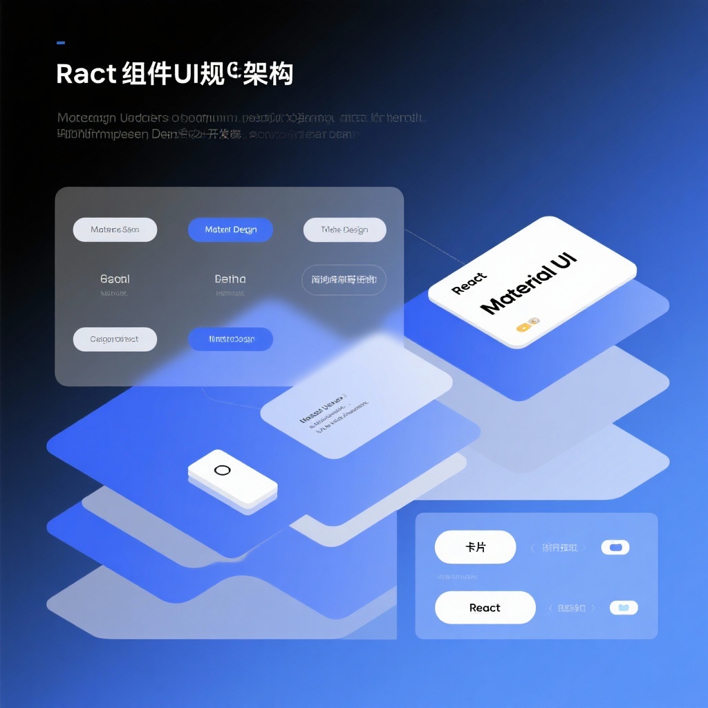
Material UI: The Definitive React Component Library for Material Design in 2025
In the fast-paced world of React development, having a reliable and comprehensive component library can make all the difference between a project that drags on for months and one that launches smoothly. Enter Material UI – the React component library that has dominated the landscape for over a decade, offering developers a robust implementation of Google's Material Design system. With over 96,600 GitHub stars and 32,600 forks, Material UI (often called MUI) has established itself as the go-to React UI library for developers seeking to build beautiful, functional interfaces with minimal effort. Whether you're looking for pre-built Material UI React components, need a comprehensive Material UI tutorial, or want to implement React Material Design principles seamlessly, this library delivers on all fronts.
Why Choose Material UI for Your React Project in 2025?
In an ecosystem crowded with React component libraries, Material UI stands out for several compelling reasons. First and foremost is its unwavering commitment to Google's Material Design specifications, ensuring your applications have a consistent, professional look that users already recognize and trust. But Material UI isn't just about aesthetics – it's a complete solution for modern React development.
What truly sets Material UI apart in 2025 is its remarkable evolution. Since its creation in 2014, the library has undergone continuous refinement, adapting to the changing needs of developers and the React ecosystem. With native Material UI TypeScript support, it aligns perfectly with current development practices, providing type safety and improved developer experience.
The library's extensive collection of MUI components covers everything from basic UI elements to complex interactive components, eliminating the need to build common interface elements from scratch. This translates to significant time savings – studies have shown that development teams using Material UI reduce their UI implementation time by up to 40% compared to building components manually.
Core Features of Material UI
Comprehensive Component Library
At the heart of Material UI lies its vast collection of over 50 pre-built components. From simple buttons and inputs to sophisticated data tables and navigation elements, the library provides everything you need to build a complete application. Each component is meticulously crafted to follow Material Design guidelines while remaining flexible enough for customization.
Some standout components include:
- Buttons: With variants for text, contained, outlined, and icon buttons
- Navigation: AppBar, Drawer, Tabs, and Breadcrumbs for intuitive user journeys
- Data Display: Cards, Lists, Tables, and Grids for organizing information
- Feedback: Alerts, Snackbars, Progress indicators, and Dialogs for user communication
Seamless Theming and Customization
Material UI's theming system is one of its most powerful features. The library comes with a default theme that provides a cohesive design language, but you can easily customize it to match your brand identity. Through the ThemeProvider, you can modify colors, typography, spacing, and other design tokens to create a unique look for your application.
jsx
import { createTheme, ThemeProvider } from '@mui/material/styles';

const theme = createTheme({
  palette: {
    primary: {
      main: '#1976d2',
    },
    secondary: {
      main: '#dc004e',
    },
  },
});

function App() {
  return (
    <ThemeProvider theme={theme}>
      {/* Your components here */}
    </ThemeProvider>
  );
}
Responsive Design Built-In
In today's multi-device world, responsive design is non-negotiable. Material UI components are inherently responsive, adapting to different screen sizes and orientations out of the box. The library provides a robust grid system and responsive utilities that make building layouts for mobile, tablet, and desktop a breeze.
Accessibility First
Material UI prioritizes accessibility (a11y) with built-in support for keyboard navigation, screen readers, and proper ARIA attributes. Each component undergoes rigorous accessibility testing to ensure your application can be used by everyone, regardless of ability or device.
TypeScript Support
As mentioned earlier, Material UI TypeScript integration is first-class. The library is written in TypeScript, providing type definitions that enhance developer experience through autocompletion and type checking. This results in fewer bugs and more maintainable code, especially in larger projects.
Getting Started with Material UI: Installation and Basic Setup
Ready to start using Material UI in your project? The installation process is straightforward, whether you're starting a new project or adding it to an existing one.
Material UI Installation
For a new or existing React project, you can install Material UI using npm or yarn:
bash
## Using npm
npm install @mui/material @emotion/react @emotion/styled

## Using yarn
yarn add @mui/material @emotion/react @emotion/styled
If you plan to use the Material Icons, you'll also want to install the icon package:
bash
npm install @mui/icons-material
## or
yarn add @mui/icons-material
Basic Usage Example
Once installed, you can start using Material UI components right away. Here's a simple example of a Material UI app structure:
jsx
import * as React from 'react';
import Button from '@mui/material/Button';
import AppBar from '@mui/material/AppBar';
import Toolbar from '@mui/material/Toolbar';
import Typography from '@mui/material/Typography';
import Container from '@mui/material/Container';

function App() {
  return (
    <div>
      <AppBar position="static">
        <Toolbar>
          <Typography variant="h6">
            Material UI Example
          </Typography>
        </Toolbar>
      </AppBar>
      <Container sx={{ mt: 4 }}>
        <Typography variant="h4" gutterBottom>
          Welcome to Material UI
        </Typography>
        <Button variant="contained" color="primary">
          Get Started
        </Button>
      </Container>
    </div>
  );
}

export default App;
This simple example demonstrates how easily you can create a polished interface with just a few Material UI components.
Practical Material UI Examples and Use Cases
Material UI is versatile enough to handle projects of all sizes and types. Here are some common use cases where the library excels:
Admin Dashboards
The comprehensive component set makes Material UI ideal for building admin interfaces. Data tables, charts (when integrated with libraries like Recharts), and navigation components combine to create powerful dashboards with minimal effort.
E-commerce Applications
Product listings, shopping carts, and checkout flows can be quickly assembled using Material UI's Cards, Grids, and Form components. The theming system allows for customization to match brand identities.
SaaS Applications
For software-as-a-service products, Material UI provides the perfect balance of professional design and development speed. The consistent component library ensures a cohesive experience across all application screens.
Mobile-First Applications
With its responsive design principles and mobile-friendly components, Material UI is excellent for building applications that prioritize mobile users.
Material UI vs. Other React Component Libraries
How does Material UI stack up against other popular React component libraries in 2025?
Material UI vs. Ant Design
Ant Design offers a more enterprise-focused set of components but follows its own design system rather than Material Design. Material UI provides more flexibility for customization and has a larger community, but Ant Design includes some advanced components out of the box that Material UI doesn't.
Material UI vs. Chakra UI
Chakra UI is gaining popularity for its simplicity and accessibility focus. While it's generally lighter weight than Material UI, it offers fewer pre-built components and less comprehensive documentation.
Material UI vs. Tailwind CSS
Tailwind CSS takes a different approach as a utility-first CSS framework rather than a component library. While it offers maximum flexibility, it requires more work to build consistent interfaces compared to Material UI's component-based approach.
Conclusion: Is Material UI Right for Your Next Project?
After more than a decade of development and refinement, Material UI has solidified its position as one of the top React component libraries available in 2025. With its extensive collection of Material UI components, native TypeScript support, and comprehensive theming options, it provides an exceptional foundation for building modern web applications.
Whether you're a seasoned developer looking to accelerate development or a beginner seeking a well-documented React UI library, Material UI delivers on multiple fronts. The active community, thorough documentation, and regular updates ensure that the library will continue to evolve with the React ecosystem.
If you're working on a project that would benefit from a professional, consistent design system without the overhead of building components from scratch, Material UI is an excellent choice. Its adherence to Material Design principles provides a familiar user experience, while its customization options allow for unique branding.
Ready to get started with your Material UI tutorial? Visit the official documentation for comprehensive guides, examples, and API references to help you make the most of this powerful library. With Material UI, you can transform your React projects with beautiful, functional interfaces that delight users and streamline development.
As the React ecosystem continues to evolve, Material UI remains a reliable, forward-thinking choice for developers who want to build exceptional user interfaces with efficiency and style.